Gamers Start Petition To Keep Old Corsair Logo
Corsair announced a new gaming product line yesterday and with that came a new product logo. It appears that a handful of gamers are upset with the new logo and have set up a petition for Corsair to ditch the new logo and stick with the old one. Many people are calling it a ‘tramp stamp’ and are upset of the use of the color yellow. What do you think?

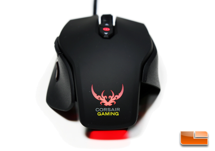
The new Corsair Gaming product logo is above and the old Corsair logo that has been around for over a decade is below. Would you go with the sails or the tribal ‘lower back tattoo’ on your gaming products? ![]() The Corsair Gaming marketing video below shows a character with crossed swords that are identical to the logo, so it can’t be a tramp stamp if they are swords right? Corsair Gaming has the strength of a Master Swordsman!
The Corsair Gaming marketing video below shows a character with crossed swords that are identical to the logo, so it can’t be a tramp stamp if they are swords right? Corsair Gaming has the strength of a Master Swordsman!
The best comment that we have seen yet is this one; “I dated a girl once with the Corsair Gaming logo. Might as well have been a bullseye.” Other comments include:
The new logo is already kinda ugly but the bright yellow stuff that’s going on is just terrible.
Does the new Corsair Gaming logo take away from the products?